Each tale is an allegory focusing on the moral faults of man and what they have created as a result of their actions. The theme of time plays a crucial role in these stories to show man’s destructive nature by stepping off the path and changing the past, not paying attention to the present resulting in desolation, and sacrificing the future by misusing technology.


The permanence and weight of each moment eludes us as we’re living it, but once a series of moments are strung together, we start to see the clear path it blazes for our future.

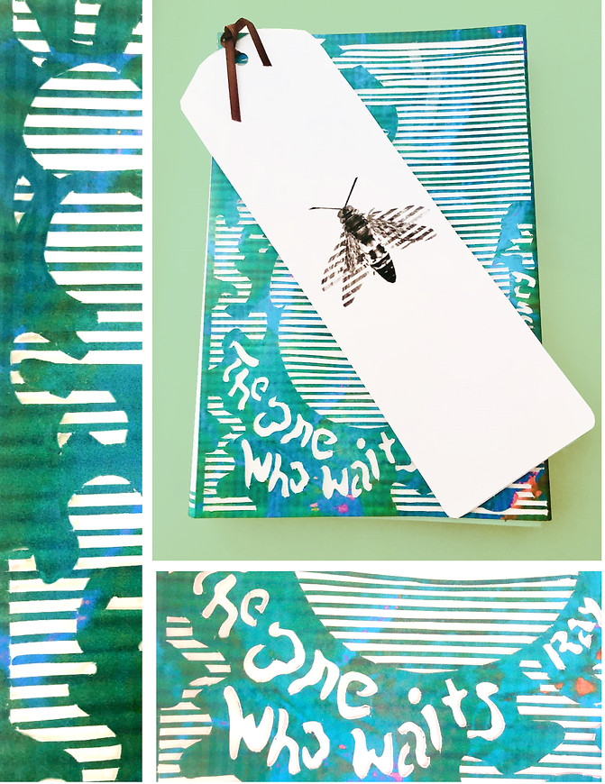
This series uses lenticular animation to show the importance of a single second through the story that is created once the customer moves the bookmark. Each line is die-cut to show the bookmark below, but also to allude to a sense of direction or path. These lines not only allow for the animation, but also create an image of a person and the title of the three short stories.


The animals chosen for the bookmarks also represent the stories they belong to. The butterfly represents “A Sound of Thunder,” because Eckles steps on a butterfly, which alters his future.
The bird represents “The Dragon” from the quote: “There was no other motion. It had been years since a single bird had flown by in the great blind shell of sky.” which alludes to a sense of direction or path. These lines not only allow for animation but also create an image of a person and the title of the three short stories.
The wasp represents “The One Who Waits”, because a wasp brings a warning to all who meet it with a powerful sting for when it feels threatened. Each bookmark depicts a flying animal, because wings represent the aspiration to achieve something higher than human condition, which is the goal of using allegories to change our ways.

The project goal was to design a series of book covers that capitalize on handmade typography and offer interactivity to promote the series. First I did some research on some successful covers.


I chose to make book covers for short stories by Ray Bradbury. I did a deep dive into the literary analysis of each story and tried to find the commonalities of each to utilize in the covers.
I did a mind map to help me find some interesting concepts that would tie all three stories together and would establish a style.
I created three concepts and the critique I got was to combine two of them to be more thematic and concrete.
I played around with a lot of different materials for making typography, but for some reason, I had a really hard time finding one that worked. My feedback was to try something completely different and to do more attempts.
I chose a typeface for the body copy and cut the main typography out with an exacto knife. I wanted to try my hand at lenticular animation, so I researched how to achieve it and carefully measured how far apart to cut the lines. It was difficult to be accurate with pretty thin lines, so it took a lot more time than a typical cutting job. (The laser cutter was down, so I had to do it by hand).
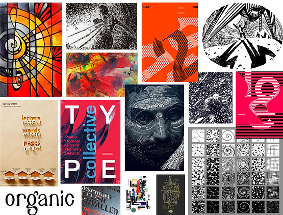
I liked the interaction of the image with the type. You could almost match the image to the type if they were all separated as everything is very stylized. I liked the layering effect of the top left with the detail being slightly obscured and favoring the type. The layouts were also interesting in how every element interacted with each other.
After trying again I found some interesting solutions and added some filler text for critique. I got the go-ahead for the bottom three, so I got to pick which direction to go into.
I also researched interesting type, because I wanted to have some fun with what I make for the series.

I did a type breakdown to use as a guide for the rest of the book cover series. I added the barcode and the Penguin Random House logo.
Previous
Next


