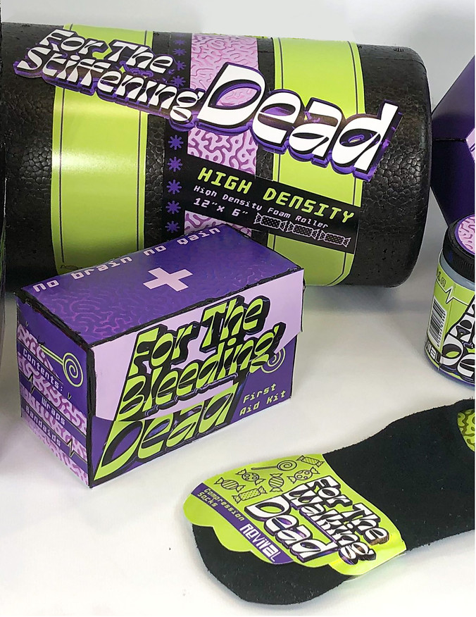

The concept is candy zombie. The zombie aspect is because it is a post work out kit, so the work out may make you low energy, aka a zombie-like state. The candy aspect is because candy can be a surprisingly effective workout tool as a burst of carbs that helps performance and muscle building. Candy is also given to people after going to the doctor, so it acts as a reward for being healthy and alludes to the act of making sure you recover properly.


The design style is based on Y2k and is more type heavy. It is pun based to emulate those cheesy sayings found in the gym to motivate people to workout harder, but in this case, it is to motivate people to take care of themselves.


The outline of the type resembles a candy wrapper, but icons of the candy itself can be found as well. Many of the zombie elements are in a metallic brain pattern as well as the shape of the packaging. Everything is made of cardboard and satin paper printing.


The project goal was to design a seven-part kit that used a variety of different packaging shapes intended to be a special novelty type of kit. Originally I was interested in making a survival kit as a nod to the zombie apocalypse survival genre. I didn't want it to be too on the nose, so I decided to mix it up with a y2k style.


I made a joint Pinterest board for a few of my classmates to add real world interesting packaging. It was fun to look through all of the specialty items.
Next was exploring different directions of the branding through word mark iterations. I thought of the name revival because it sounded similar to survival and it alludes to zombies in how they came back from the dead.
I found some fun typefaces to work with during the wordmark explorations and played with the typesetting. I wanted to focus on typography because zombie-themed items can easily become cliche and boring with literal depictions of the zombies, so I wanted to hint at them in other ways.
Here I realized that the standard survival kit just wasn't working. It was too literal for the zombie theme, so I thought of other things that could remind you of zombies. I thought of how the feeling of exhaustion after a workout makes me feel like a zombie on the journey home, so I thought that making a post-workout kit would be a zombie revival kit of sorts.
The pun opportunity I had looked into earlier also would work for the new type of kit, because many gyms have inspirational quotes or cheesy lines on their walls. It was important to really lean into it to avoid the brand taking itself too seriously.
I wanted the type to have a candy wrapper texture, so I found an adobe photoshop plugin called candy, which had a lot of 3d asset textures that you could apply to a 2d shape. It had an interesting chrome finish that resembled the shine of candy wrappers quite well.
I continued tweaking the type to make sure it was a good balance of decorative and legible. I also found a few icons of candy that could help round out the design and show the concept better.
I looked at many different dielines to find unique shapes that would suit the novelty of this kit, but I had to make some on my own as well. I made templates from cardboard and scanned them in to create the digital files.


Then I pieced all the elements into the packaging designs making sure the product was clear, the packaging requirements were there, and the candy zombie concept came across on all sides.
I really enjoyed using the green and purple throughout as well as the brain texture and heart beat lines.
Previous
Next


